Creativity is limitless. Concepts can be combined with ideas, then combined with media, then combined with fantasy, then combined with digital, then….well, you get the idea.
For fun and creative exercising, the Museum of Block Art was developed to showcase art made with WordPress Gutenberg Blocks.
Speaking of WordPress, this year marks the 20th anniversary since this amazing platform was created. To help celebrate, the Museum of Block Art has an open call for submissions.
The condition is that the submission should use either (or both) of the topics below for inspiration when creating your WP20-inspired blocks:
- The 20th-anniversary logos
- The default themes through the years (color palette, images, etc.)
I chose to give this a whirl, riffing off of one of the logos … this one, to be precise:

The fun/frustrating part of working with blocks is finding ways to achieve something close to what you envision while dealing with any limitations within the block settings.
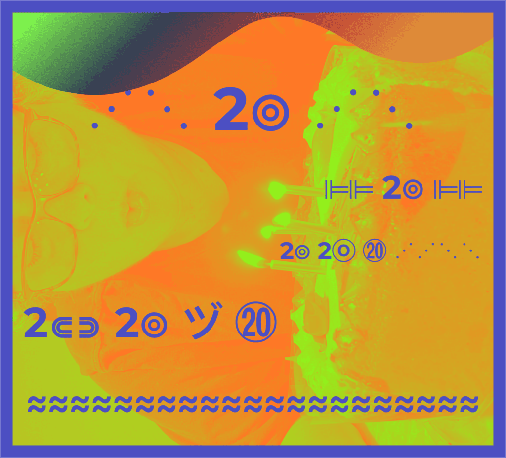
My goal with this submission was to have some fun with the “curvy look”, the “lines within lines”, or the “duplicated strokes” within the logo.
Because I wanted to use a Cover block, which doesn’t have border controls, I couldn’t play with border radius to give some curve and I couldn’t find a way to give it a double-border. So, just before I gave up, I had a thought. What if I play with the text instead to achieve some semblance of that same idea?
Since I couldn’t do much with plain typography, I decided to use symbols to get the effect I was after. I simply scrolled through some copy/paste symbols and used the ones I liked within the paragraphs.
As a final wavy flourish, I moved the Cover block into a Group block. This gave me two additional ways to end this with some style. I placed a border around the Group block. I still couldn’t use the border radius for fun effects because that allowed the square corners of the cover block to show through, and while that might be kind of interesting, it wasn’t what I was after. Still, just having a nice thick border gave the piece of art a “frame” of sorts.
And then, for the last touches, I gave the Group block a gradient background, and a top wave to the Cover block. The wave allows the gradient background to peek through.
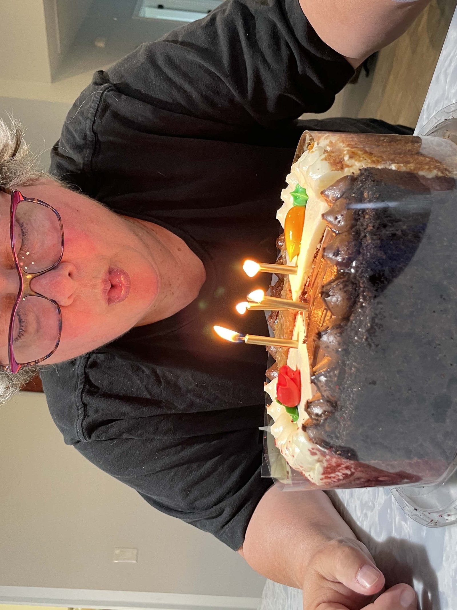
Oh, I almost forgot to mention the actual image used. This is one of my own photos, which anyone can freely use if they’d like. I’m open-sourcing it right here and now. It’s a photo of me blowing out some candles on a multi-flavored cheesecake. This particular day was the 20th anniversary of a different kind, so it seemed especially relevant to use it here. I used the Cover block’s Image Orientation setting to flip it sideways and then used the Duotone filter to get the color filter I needed.
P.S. Just before I published this post, I found another glitch. The preview looked different than what I saw in the editor. Yikes! That was almost a big problem. What was the issue? Well, the duotone filter was not showing up in the preview. That completely destroyed the entire look, so I searched online for reasons why. Turns out, since I’m using an FSE theme, and had the Gutenberg plugin activated, it wasn’t working right. Now supposedly, the bug is fixed, but obviously, for me, it’s still an issue. No worries, though, I just deactivated the Gutenberg plugin, and voilá, duotone works again. (Who know what else I broke when I deactivated, but I’m going to pretend everything is fine). UPDATE: A new version of the Gutenberg plugin fixed the problem.
No matter how art is conceived or perceived, it is fun to create, and this challenge to create some art with WordPress blocks was definitely fun.
Happy Birthday, WordPress!!!

⋰⋱ 2⦾ ⋰⋱
⊫⊫ 2⦾ ⊫⊫
2⦾ 2ⓞ ⑳ ⋰⋰⋱⋱
2⋐⋑ 2⦾ ヅ ⑳
≈≈≈≈≈≈≈≈≈≈≈≈≈≈≈≈≈≈≈≈≈
Submission Details
Ok, the information below is just for the folks who are looking at my submission to the museum. The rest of you can ignore this bit.
Screenshot:

HTML Code of the block(s):
<!-- wp:group {"layout":{"type":"constrained"}} -->
<div class="wp-block-group"><!-- wp:group {"style":{"border":{"color":"#4b4fc9","width":"20px"},"spacing":{"padding":{"top":"0","right":"0","bottom":"0","left":"0"},"blockGap":"0"},"color":{"gradient":"linear-gradient(135deg,rgb(67,255,0) 2%,rgb(46,63,86) 17%,rgb(207,46,46) 34%,rgb(236,134,27) 46%)"}},"layout":{"type":"constrained"}} -->
<div class="wp-block-group has-border-color has-background" style="border-color:#4b4fc9;border-width:20px;background:linear-gradient(135deg,rgb(67,255,0) 2%,rgb(46,63,86) 17%,rgb(207,46,46) 34%,rgb(236,134,27) 46%);padding-top:0;padding-right:0;padding-bottom:0;padding-left:0"><!-- wp:cover {"url":"/wp-content/uploads/2023/03/crop-881-0-2268-3024-90-IMG_1752-rotated.jpeg","id":5379,"dimRatio":0,"overlayColor":"secondary","contentPosition":"center center","align":"center","className":"is-style-top-wave","style":{"color":{"duotone":["#fe7825","rgb(143, 242, 30)"]}},"cropRotation":270,"cropWidth":56.25,"cropX":21.86} -->
<div class="wp-block-cover aligncenter is-style-top-wave"><span aria-hidden="true" class="wp-block-cover__background has-secondary-background-color has-background-dim-0 has-background-dim"></span><img class="wp-block-cover__image-background wp-image-5379" alt="" src="/wp-content/uploads/2023/03/crop-881-0-2268-3024-90-IMG_1752-rotated.jpeg" data-object-fit="cover"/><div class="wp-block-cover__inner-container"><!-- wp:paragraph {"align":"center","style":{"color":{"text":"#4b4fc9"},"typography":{"fontSize":"60px"}}} -->
<p class="has-text-align-center has-text-color" style="color:#4b4fc9;font-size:60px">        </p>
<!-- /wp:paragraph -->

<!-- wp:spacer {"height":"31px"} -->
<div style="height:31px" aria-hidden="true" class="wp-block-spacer"></div>
<!-- /wp:spacer -->

<!-- wp:paragraph {"align":"center","placeholder":"Write title…","style":{"typography":{"fontSize":"100px","letterSpacing":"1px"},"spacing":{"padding":{"top":"0","right":"0","bottom":"0","left":"0"},"margin":{"top":"0","right":"0","bottom":"0","left":"0"}},"color":{"text":"#4b4fc9"}}} -->
<p class="has-text-align-center has-text-color" style="color:#4b4fc9;margin-top:0;margin-right:0;margin-bottom:0;margin-left:0;padding-top:0;padding-right:0;padding-bottom:0;padding-left:0;font-size:100px;letter-spacing:1px">⋰⋱ <strong>2⦾</strong> ⋰⋱</p>
<!-- /wp:paragraph -->

<!-- wp:paragraph {"align":"right","style":{"typography":{"fontSize":"54px"},"color":{"text":"#4b4fc9"}}} -->
<p class="has-text-align-right has-text-color" style="color:#4b4fc9;font-size:54px">                                  ⊫⊫ <strong>2⦾ </strong>⊫⊫</p>
<!-- /wp:paragraph -->

<!-- wp:paragraph {"style":{"typography":{"fontSize":"30px"},"color":{"text":"#4b4fc9"}}} -->
<p class="has-text-color" style="color:#4b4fc9;font-size:30px">                         </p>
<!-- /wp:paragraph -->

<!-- wp:paragraph {"align":"right","style":{"typography":{"fontSize":"40px"},"color":{"text":"#4b4fc9"}}} -->
<p class="has-text-align-right has-text-color" style="color:#4b4fc9;font-size:40px">          <strong>2⦾       2ⓞ            </strong>          ⑳ ⋰⋰⋱⋱</p>
<!-- /wp:paragraph -->

<!-- wp:paragraph {"align":"left","style":{"typography":{"fontSize":"70px"},"color":{"text":"#4b4fc9"}}} -->
<p class="has-text-align-left has-text-color" style="color:#4b4fc9;font-size:70px">  <strong>2⋐⋑     2⦾      <strong>ヅ</strong>      ⑳ </strong> </p>
<!-- /wp:paragraph -->

<!-- wp:paragraph {"align":"center","style":{"color":{"text":"#4b4fc9"},"typography":{"fontSize":"60px"}}} -->
<p class="has-text-align-center has-text-color" style="color:#4b4fc9;font-size:60px"><strong>≈≈≈≈≈≈≈≈≈≈≈≈≈≈≈≈≈≈≈≈≈</strong></p>
<!-- /wp:paragraph --></div></div>
<!-- /wp:cover --></div>
<!-- /wp:group --></div>
<!-- /wp:group -->
Website to link to:
Title of Art Piece
Too-Oh!

Leave a Reply